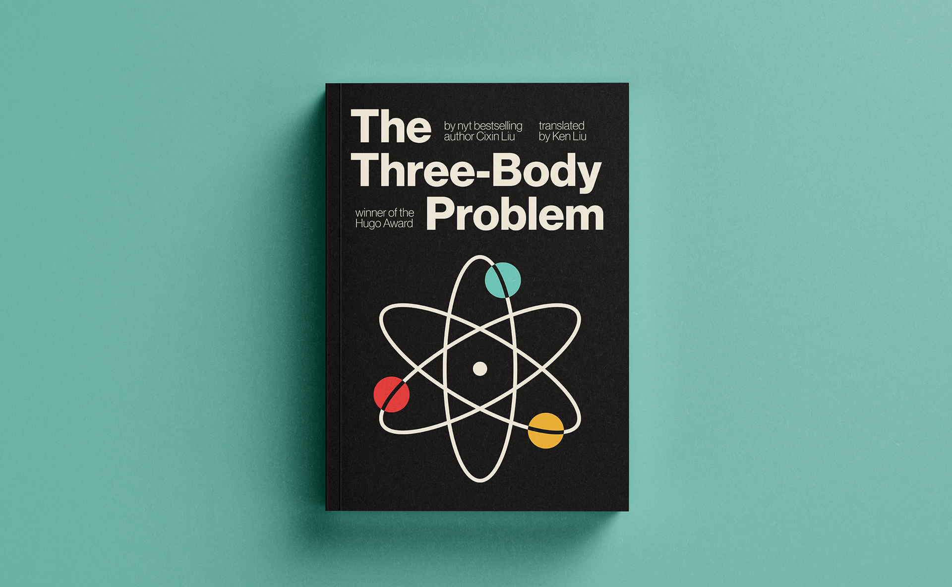
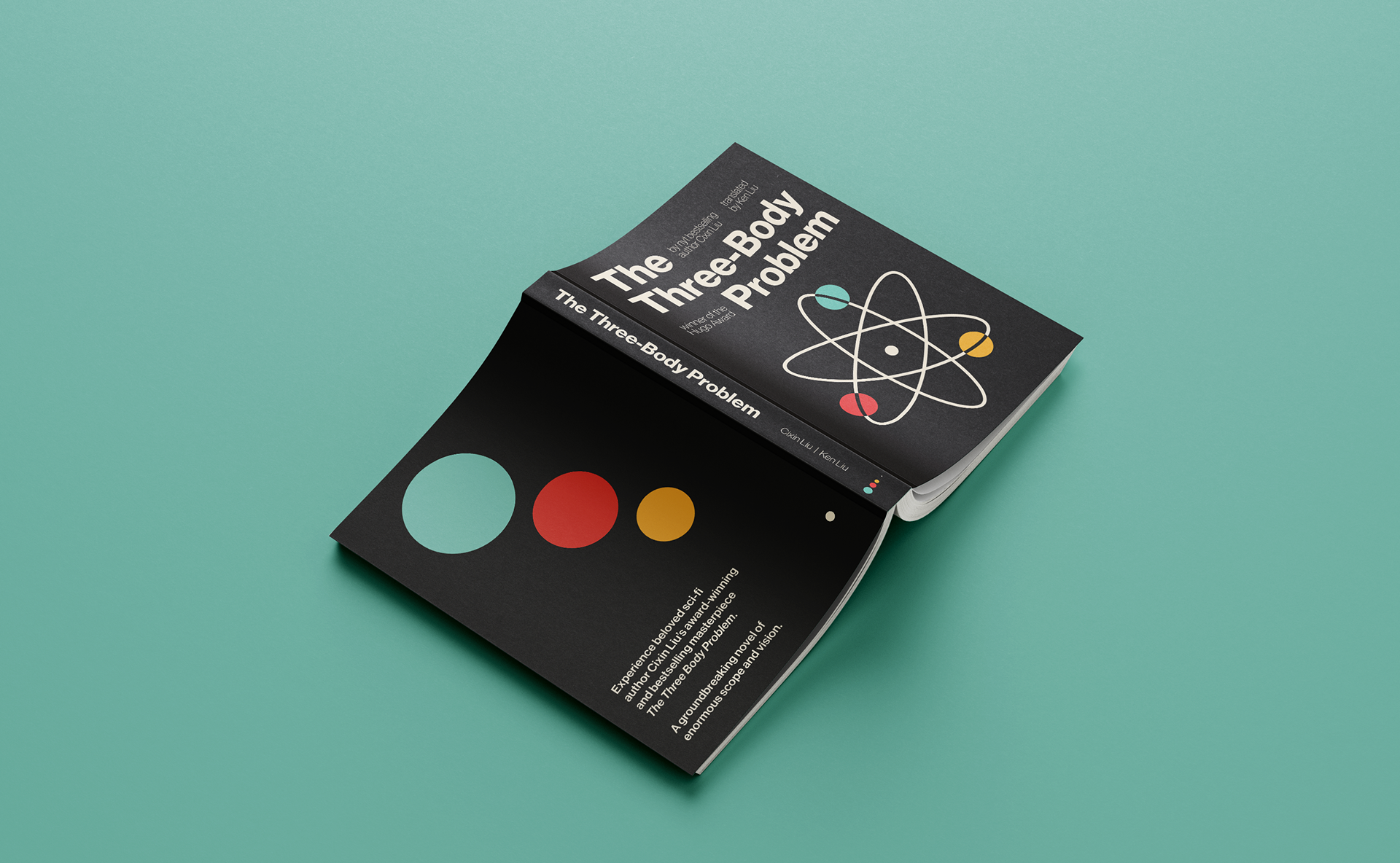
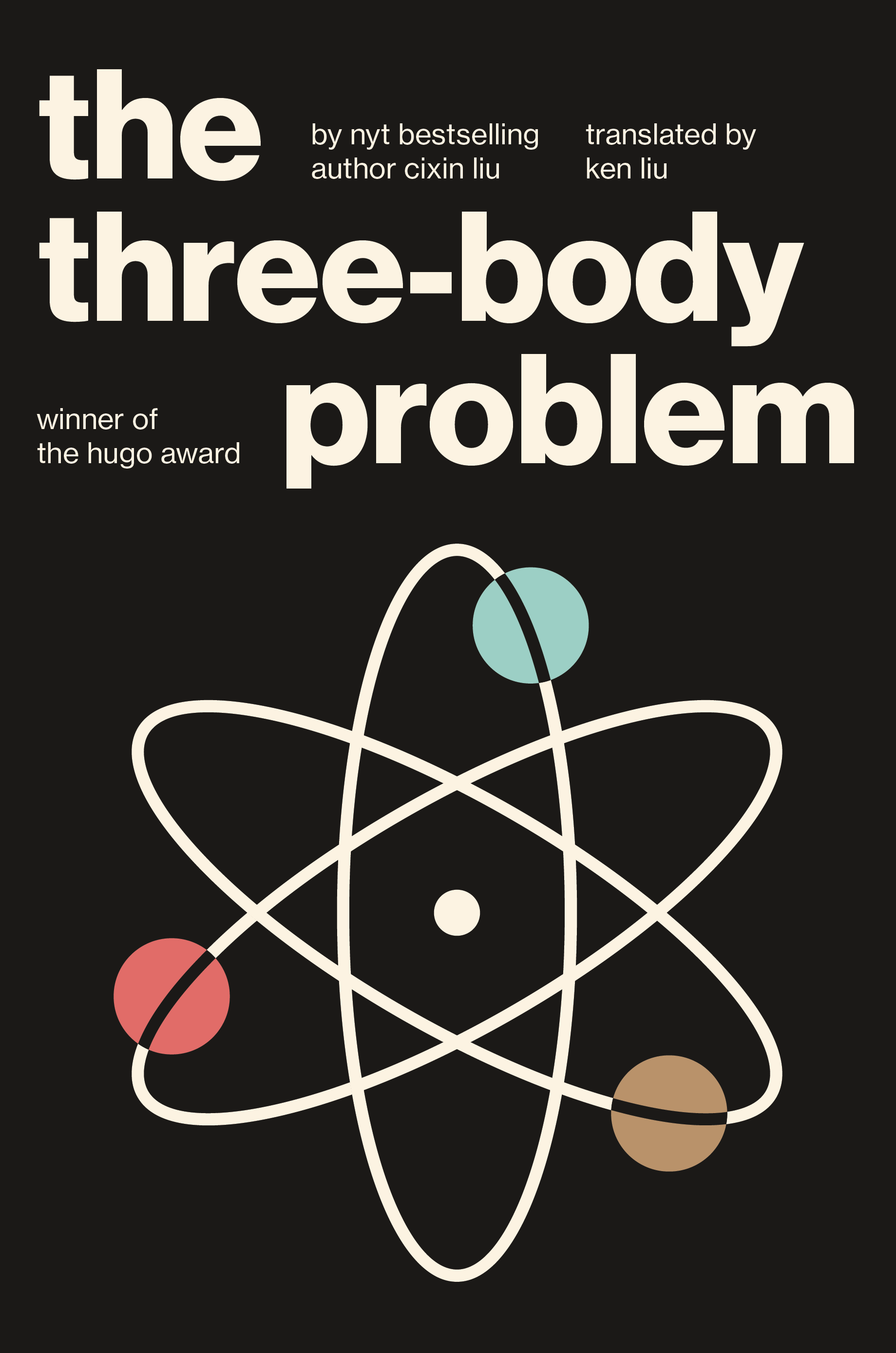
This design reimagines the book cover of the popular sci-fi novel The Three-Body Problem. The cover's striking, minimal appearance references the International Typographic Style, evincing mid-century aesthetics through primary colors. The central symbol on the cover looks like an atom, while simultaneously representing the idea of three large planetary bodies circling a single smaller one.
I chose the type family Neue Haas Grotesk for its modern, mathematical appearance and its historical connection to the Swiss style. Warm primary colors provide contrast with the cover's black background; the teal in particular reminded me of science and spacecraft. The repeated circular imagery is inspired by the orbits of planetary bodies.
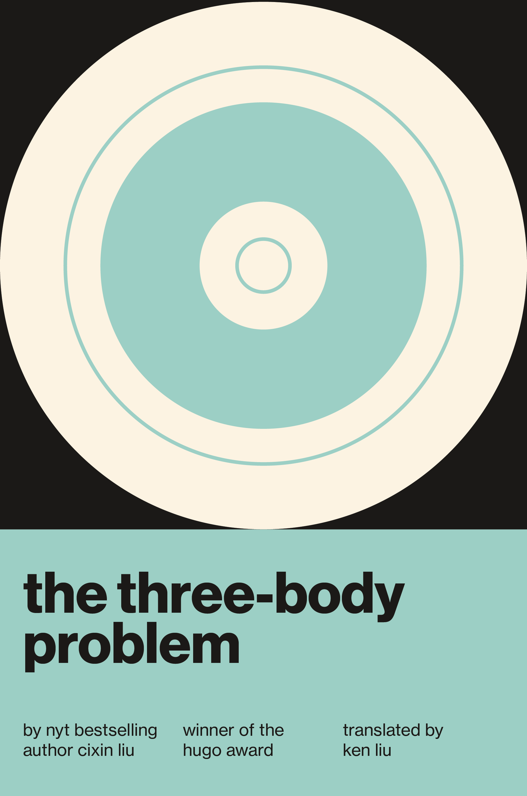
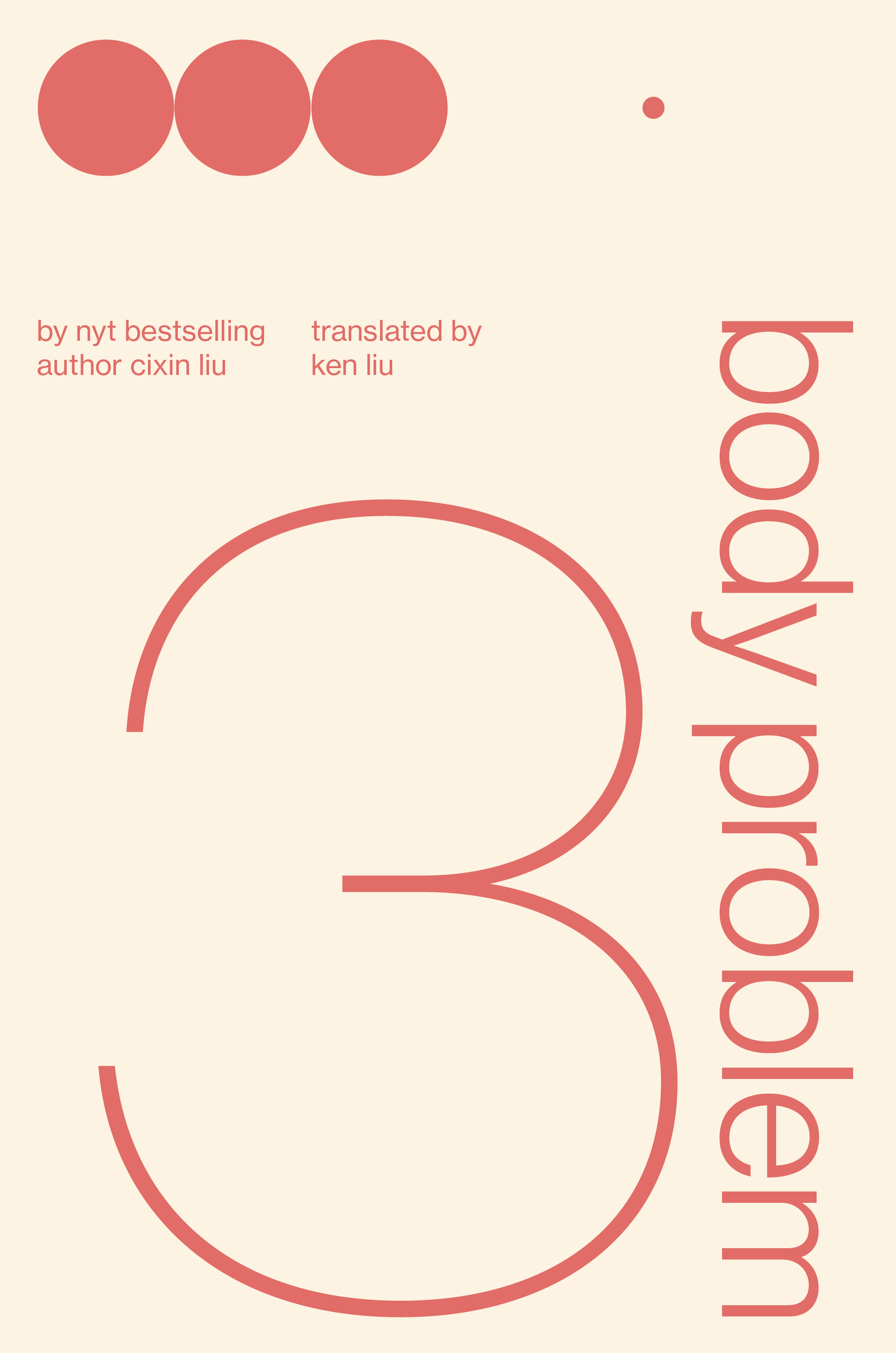
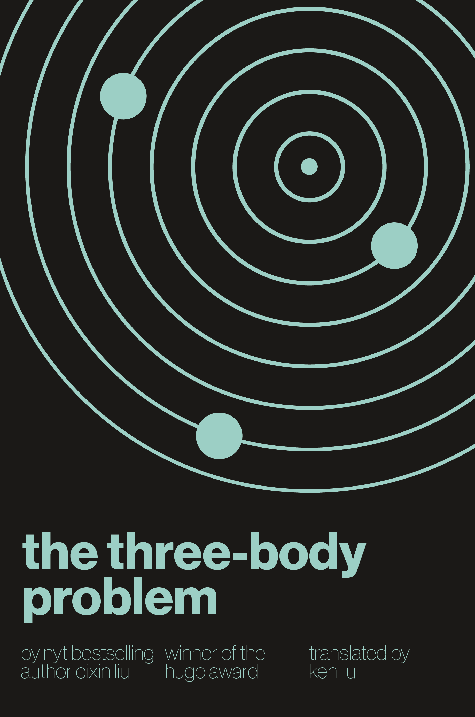
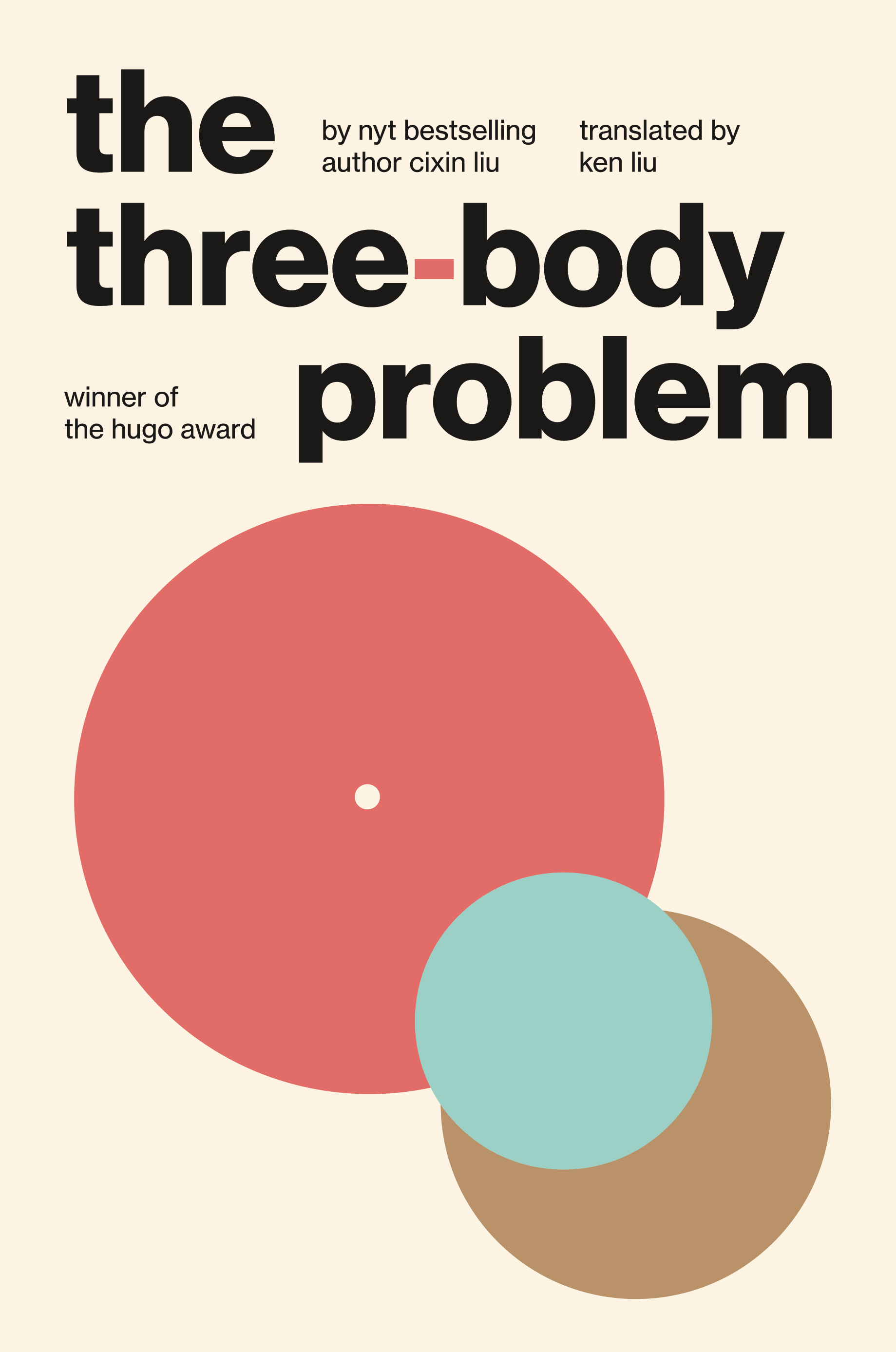
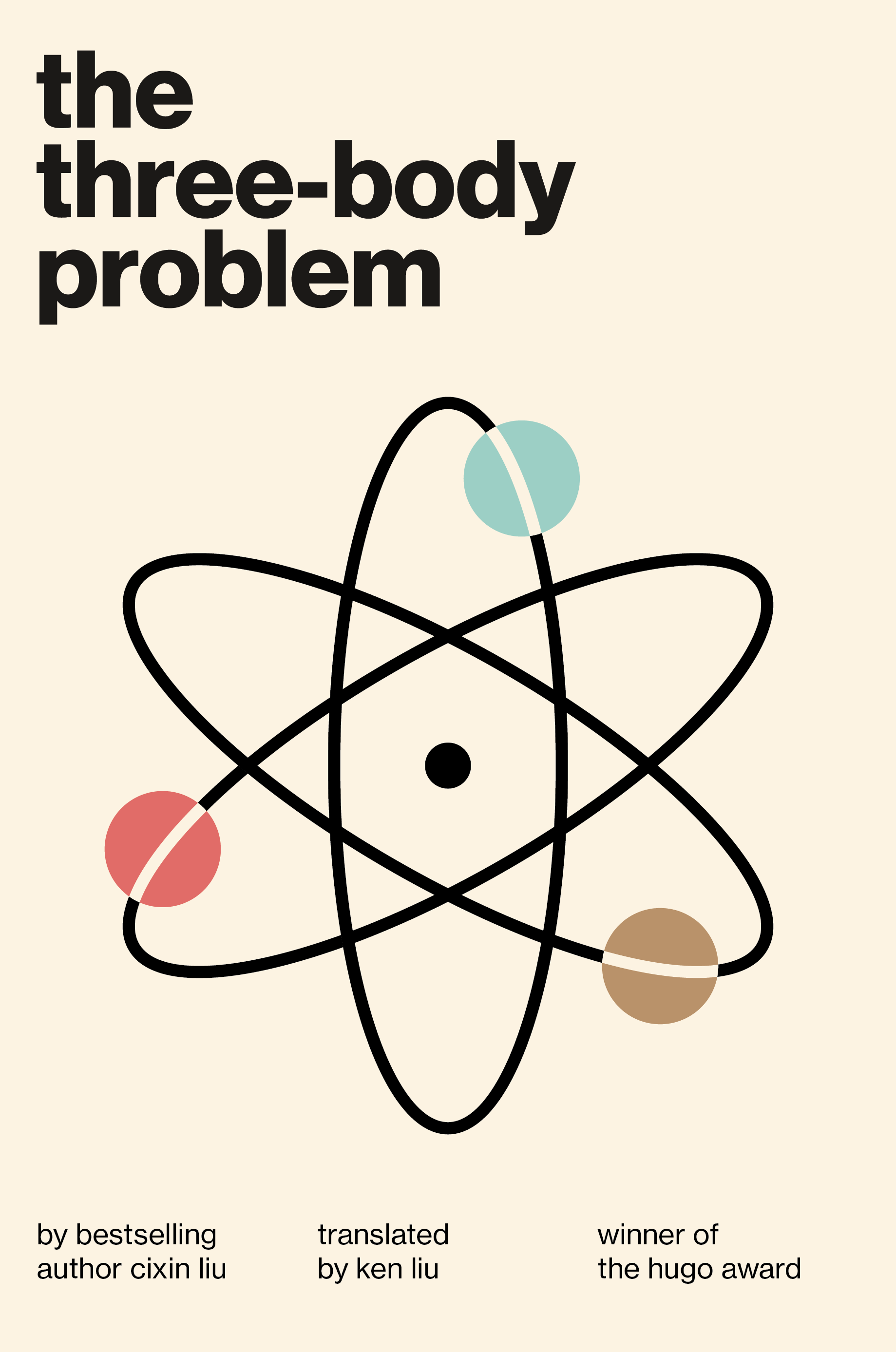
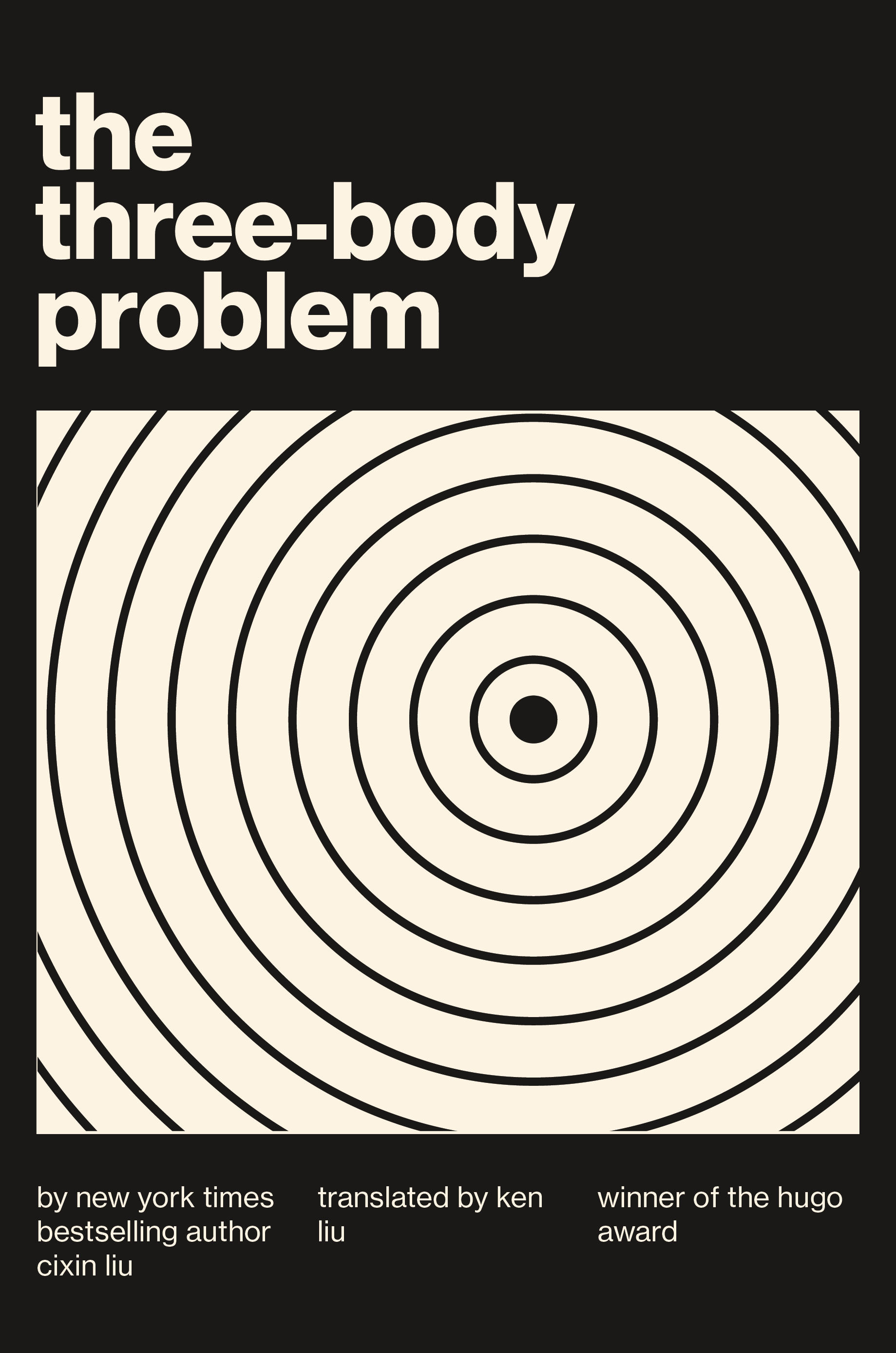
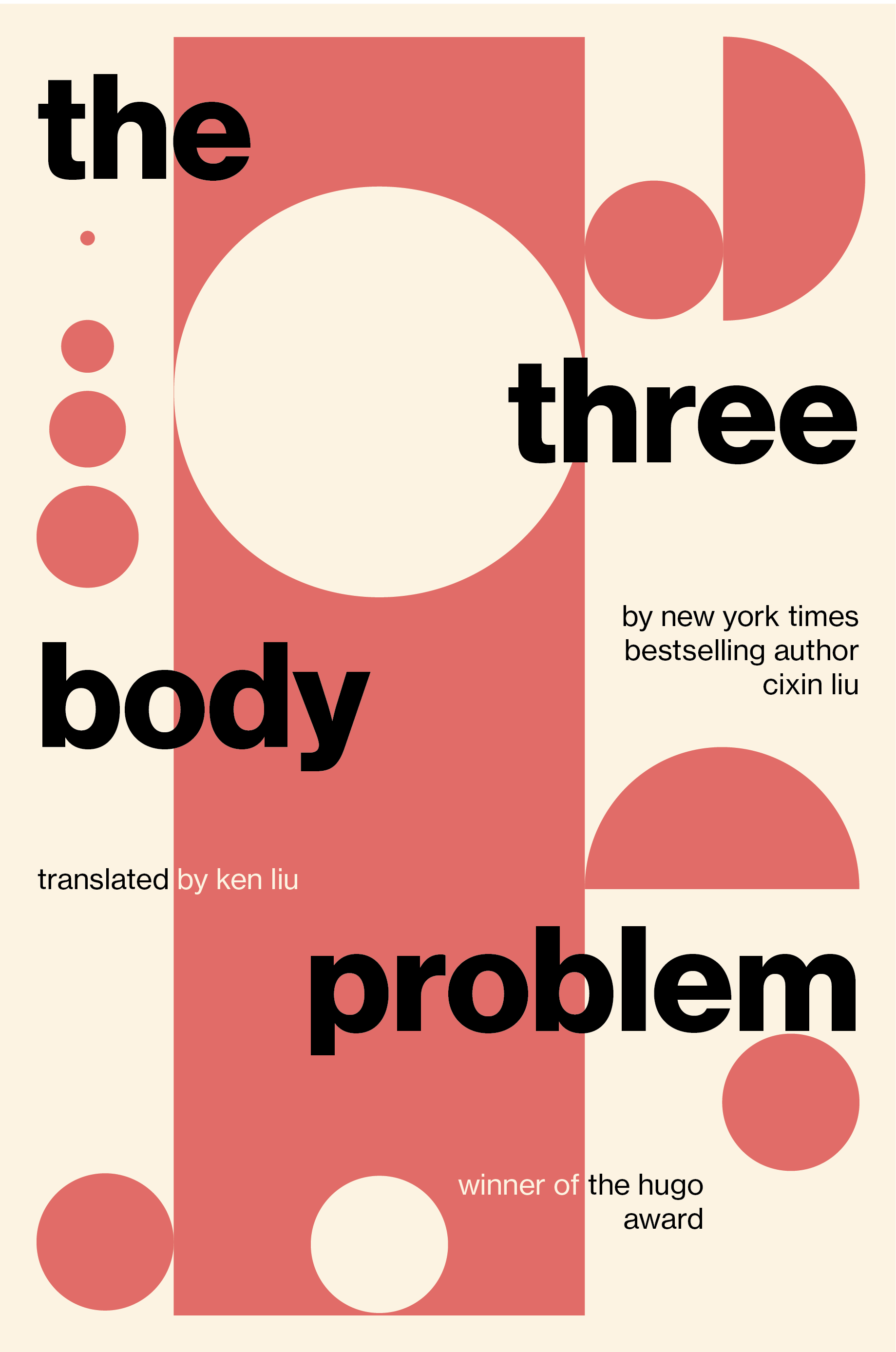
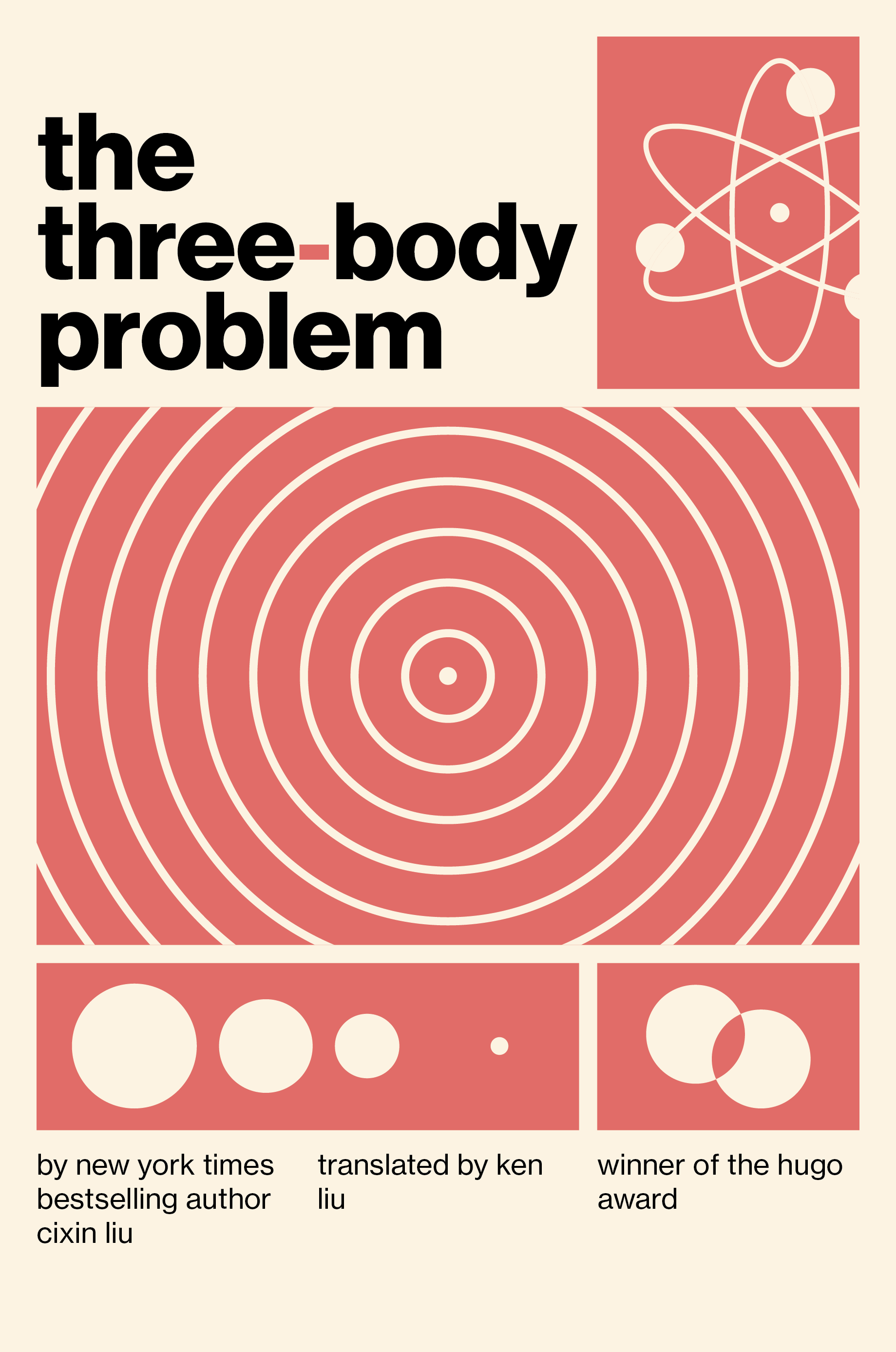
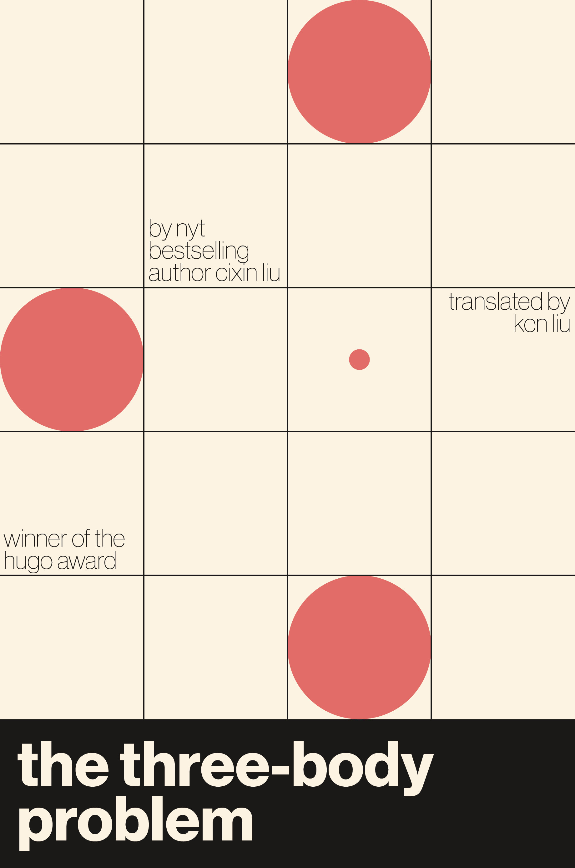
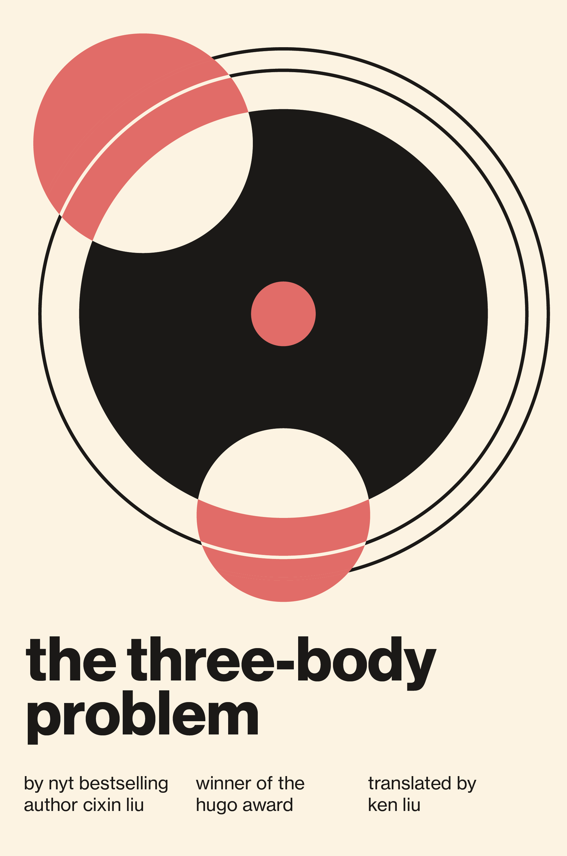
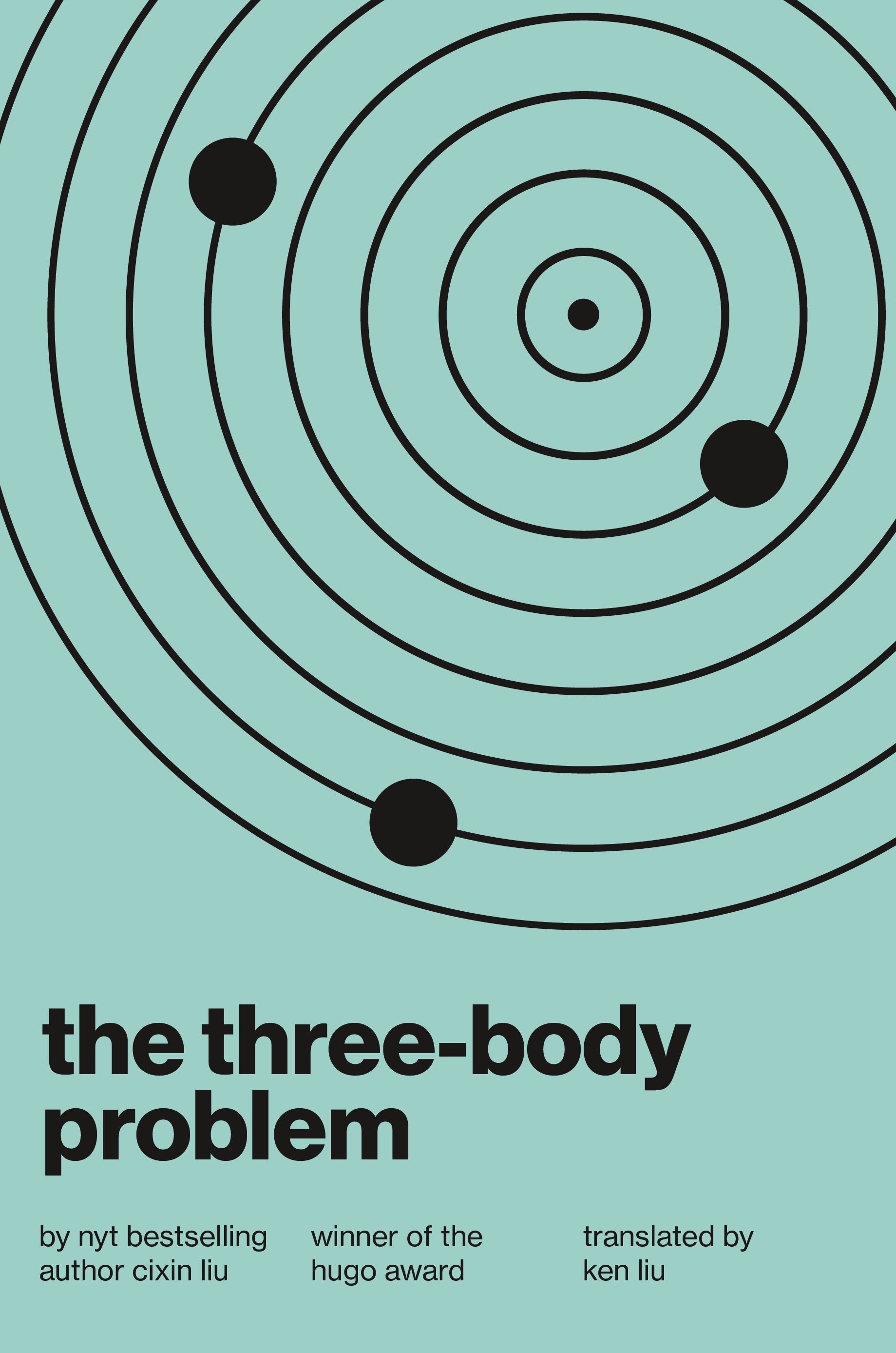
In order to capture the book's essence while staying true to the minimalist style required by the brief, I created twelve draft covers. Exploration was a critical aspect of this phase, and I experimented with grid layouts and geometry.

