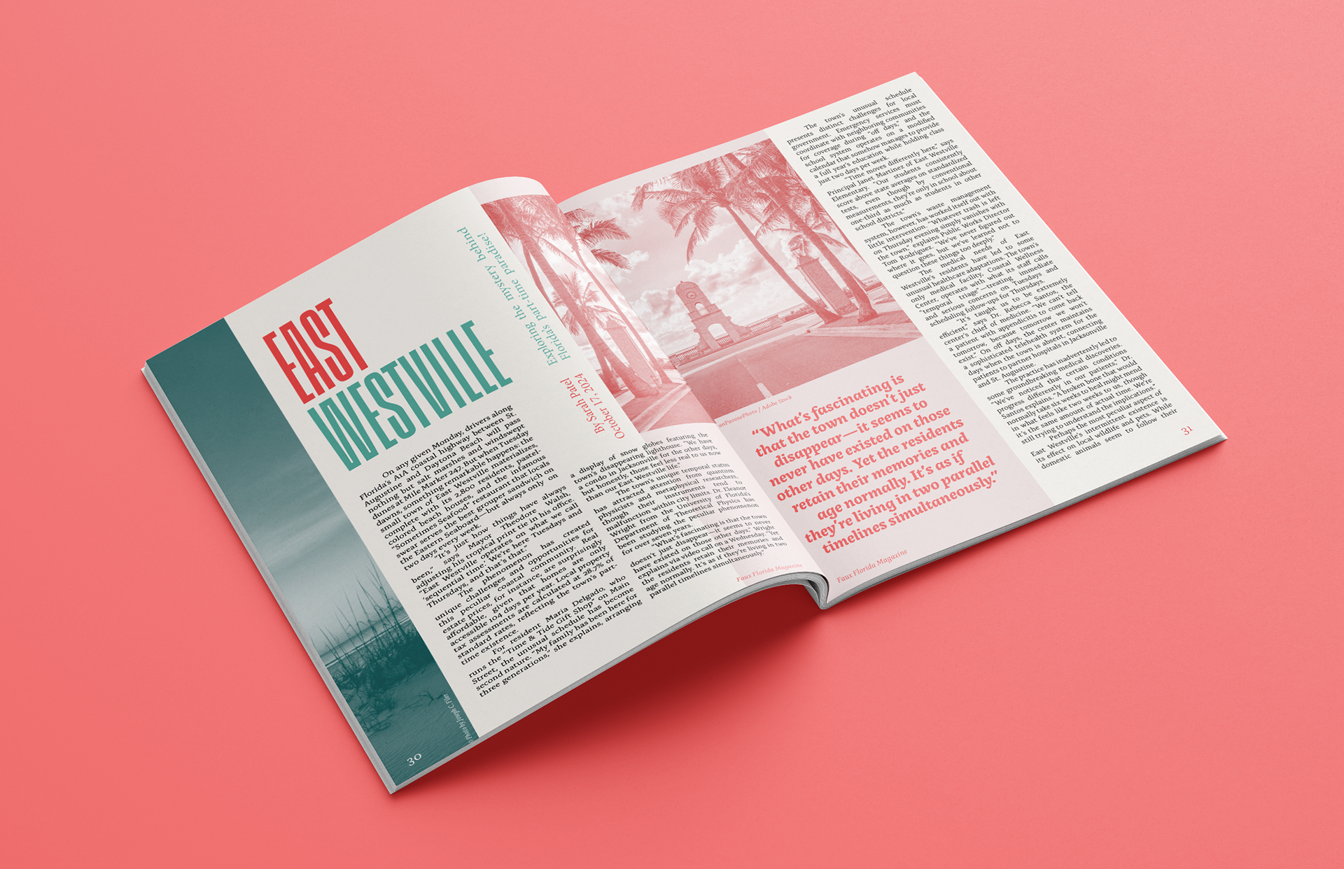
For this project, I designed a four-page magazine spread covering the story of a fictitious Florida town. Since this fictional town experiences unusual gaps in time, I created a magazine layout that utilizes unconventional text and layout formatting, with disruptively large images and upside-down columns containing lines of missing text.
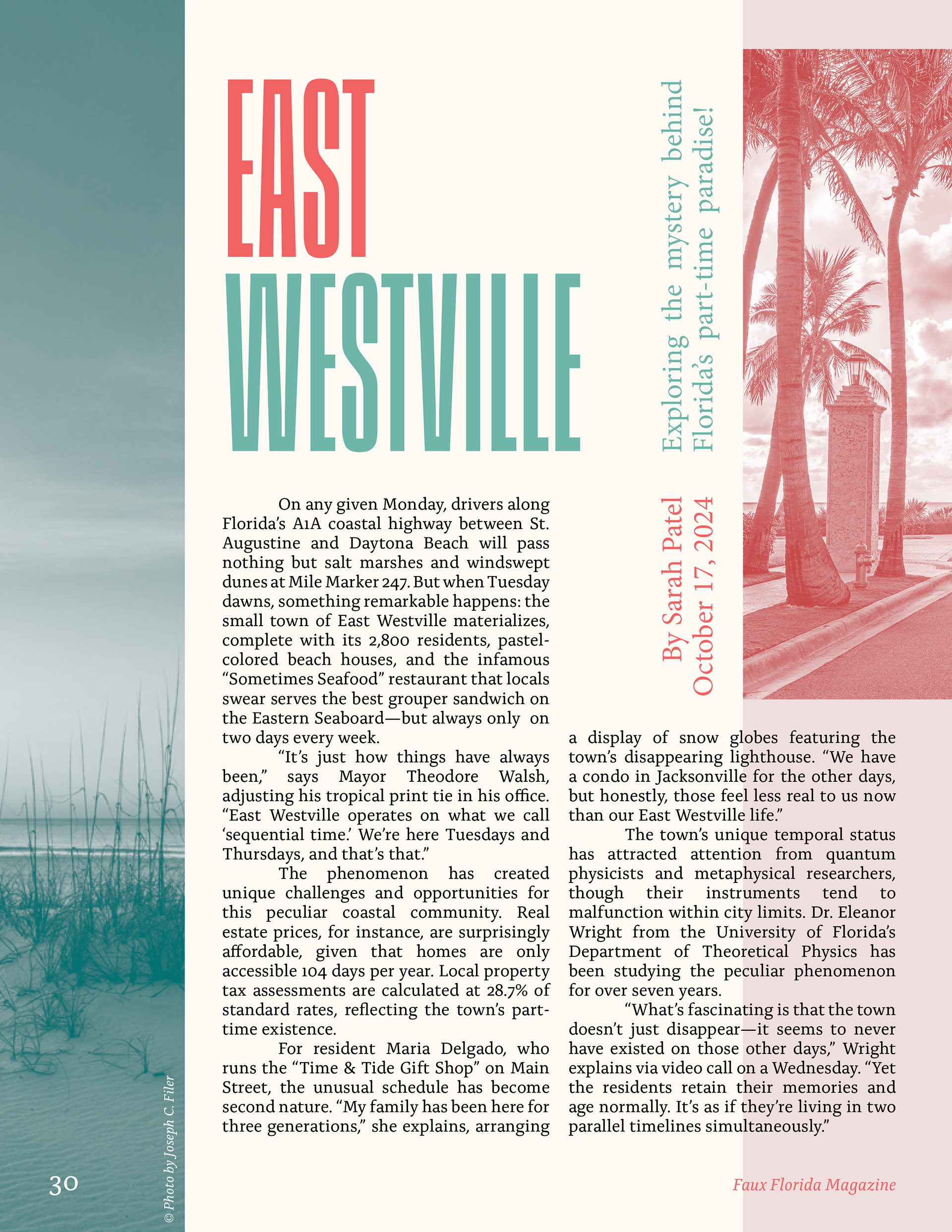
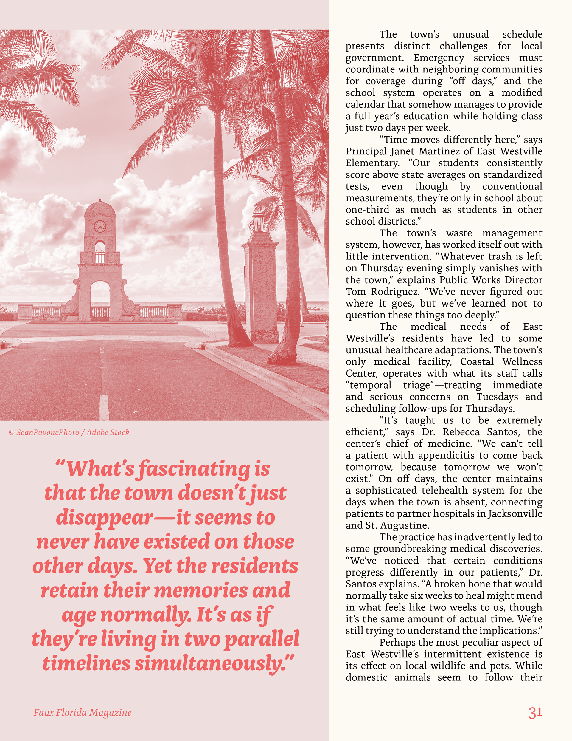
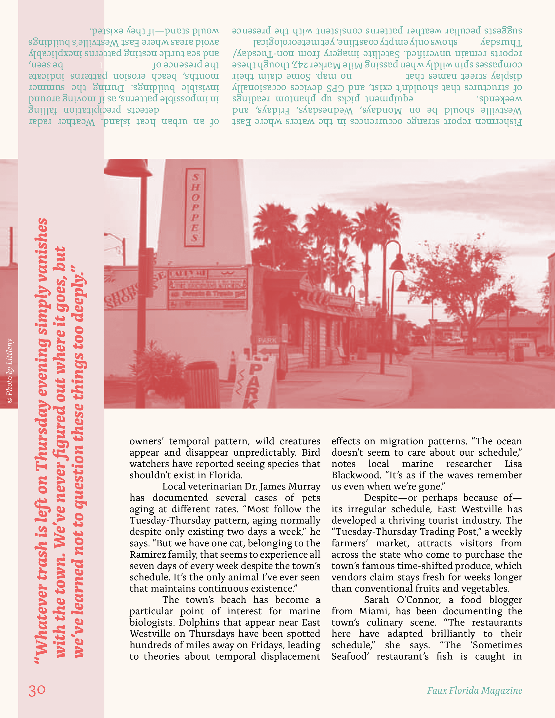
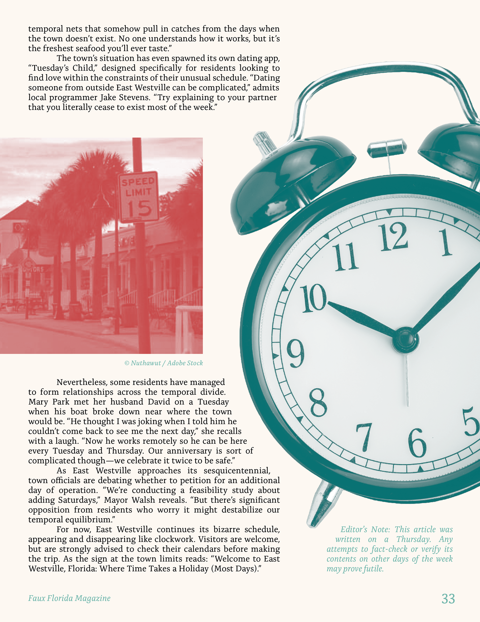
During the ideation phase, I decided that the magazine spread would reflect the town’s unusual temporal occurrences through typographic and formatting anomalies. To emphasize the town’s beach aesthetic, I used a limited color palette of beige, pink, and teal; these colors allude to sand, coral, and water.
