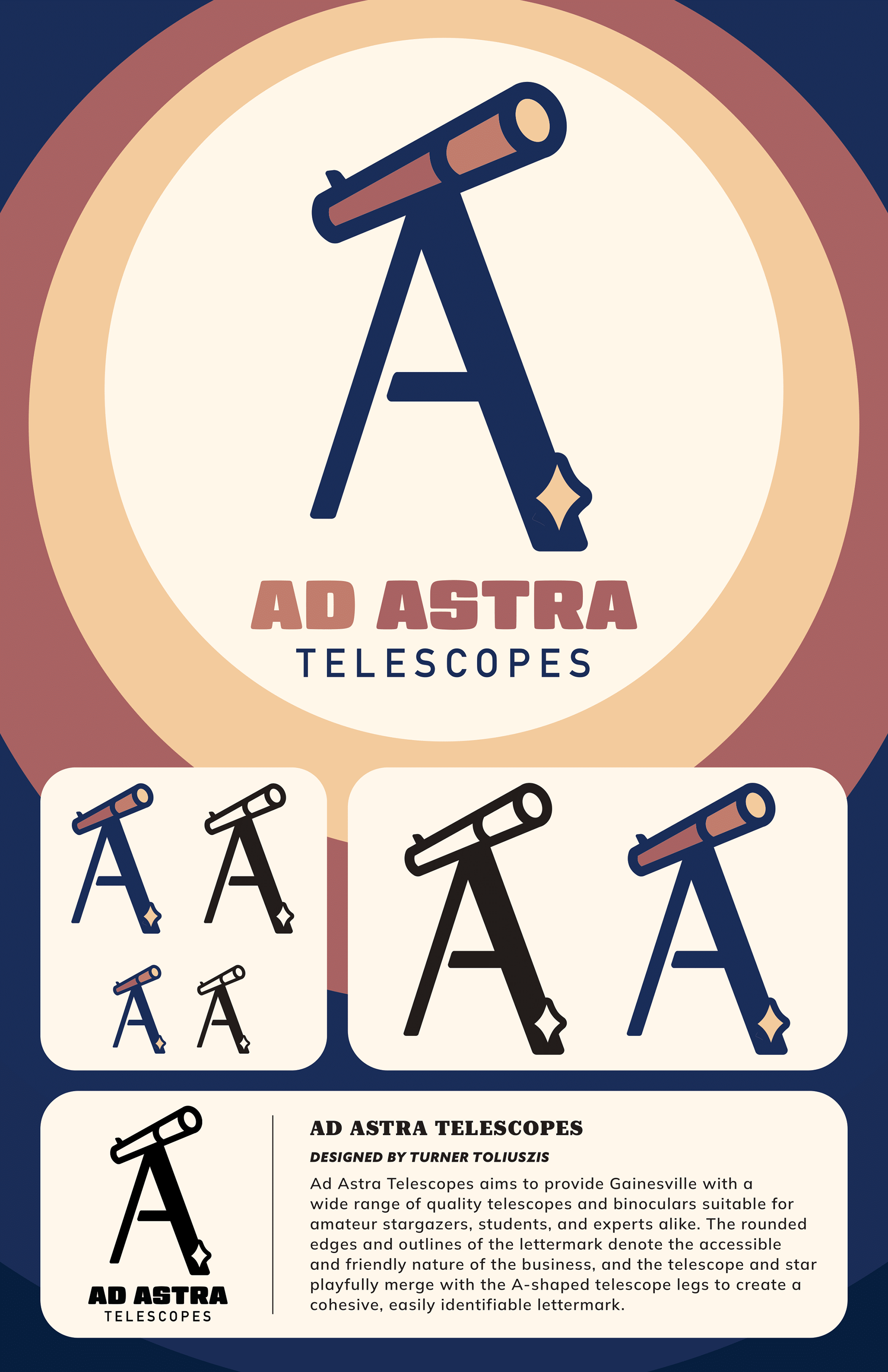
This project, a letter mark logo for a small astronomy supply shop, required both visual and typographic elements. I chose to create a graphic of a telescope with the letter 'A' doubling as the telescope's legs. The logo is rounded and uses thick outlines to convey friendliness and to show that the shop welcomes beginners and professionals alike.
I chose Gigalypse, a bold and rounded typeface, as the primary typeface for this project due to its synergy with the letter mark I had designed. The muted blue and yellow color palette evinces the imagery of space, in addition to materials such as wood or gold. I created several mockups of posters, signage, and merchandise to envisage how the logotype would work in different contexts.

